Adding text to video increases view time by up to 12% by making content accessible and scannable, especially since 85% of social media videos are watched on mute. For creators, this means better retention, clearer messaging, and optimized performance across platforms like YouTube, TikTok, and Instagram. Mastering text overlays is a direct path to holding audience attention and driving your message home.
Table of Contents
Explore all Video Creator Guides →
Quick Start
- Define Your Goal: For maximum control (YouTube), use a desktop editor. For speed (TikTok/Reels), use a mobile app. For simple one-offs, use a browser tool.
- Select Your Tool: DaVinci Resolve (desktop), CapCut (mobile), or a web-based editor.
- Import & Add Text: Load your video clip and use the 'Text' or 'Title' tool to create a new text layer.
- Style & Position: Set font to a sans-serif like Roboto at 72-90pt for titles. Position text within platform-specific safe zones (e.g., avoid bottom 150px on TikTok).
- Animate & Time: Apply a subtle animation (e.g., fade-in) with a duration of 0.3-0.5 seconds. Ensure text is on-screen long enough to read (1 second per 3 words).
- Export & Publish: Render the video and upload it to your target platform.
Choosing the Right Video Text Workflow
Before selecting a font, your first decision is where you will add the text. The tool you choose dictates the trade-off between creative control, speed, and features. There is no single "best" option; the correct workflow is the one that achieves your specific goal most efficiently.
For long-form YouTube content requiring brand consistency and precise animations, a desktop editor is the only viable choice. For a TikTok trend that has a 12-hour lifespan, a mobile app is the practical solution. The objective is to match the tool to the task.
This decision framework illustrates which path is most logical for your project.
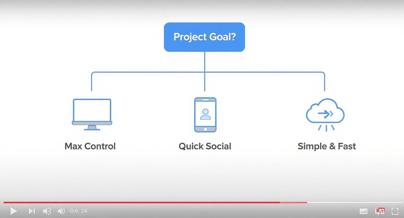
Figure 1: A decision framework mapping project goals to the appropriate toolset: desktop for control, mobile for speed, and cloud-based for simplicity.
Your end goal—whether maximum creative freedom, rapid social media deployment, or a simple one-off task—directly determines the right toolset.
Workflow Comparison
This table breaks down the core differences between the main approaches. Use it to select a tool based on your project's primary requirement.
| Workflow | Control Level | Speed | Best For | Key Limitation |
|---|---|---|---|---|
| Desktop Editor | Maximum | Slow | Branded content, YouTube, complex animations | Steep learning curve, time-intensive |
| Mobile App | Limited | Very Fast | TikTok, Reels, Shorts, trending content | Generic styles, limited customization |
| Browser Tool | Medium | Fast | Simple tasks, collaboration, quick captions | Often has file size or resolution limits |
Each workflow serves a purpose. A professional creator may use all three within a single week for different projects. The skill is knowing which one to use for the task at hand.
Desktop Editors: The Professional Standard
For absolute, granular control, professional desktop software like DaVinci Resolve, Adobe Premiere Pro, or Final Cut Pro is the standard. These applications are built for pixel-perfect precision over every element, from font kerning to complex keyframe animations. This is the required workflow for polished YouTube videos and branded marketing content.
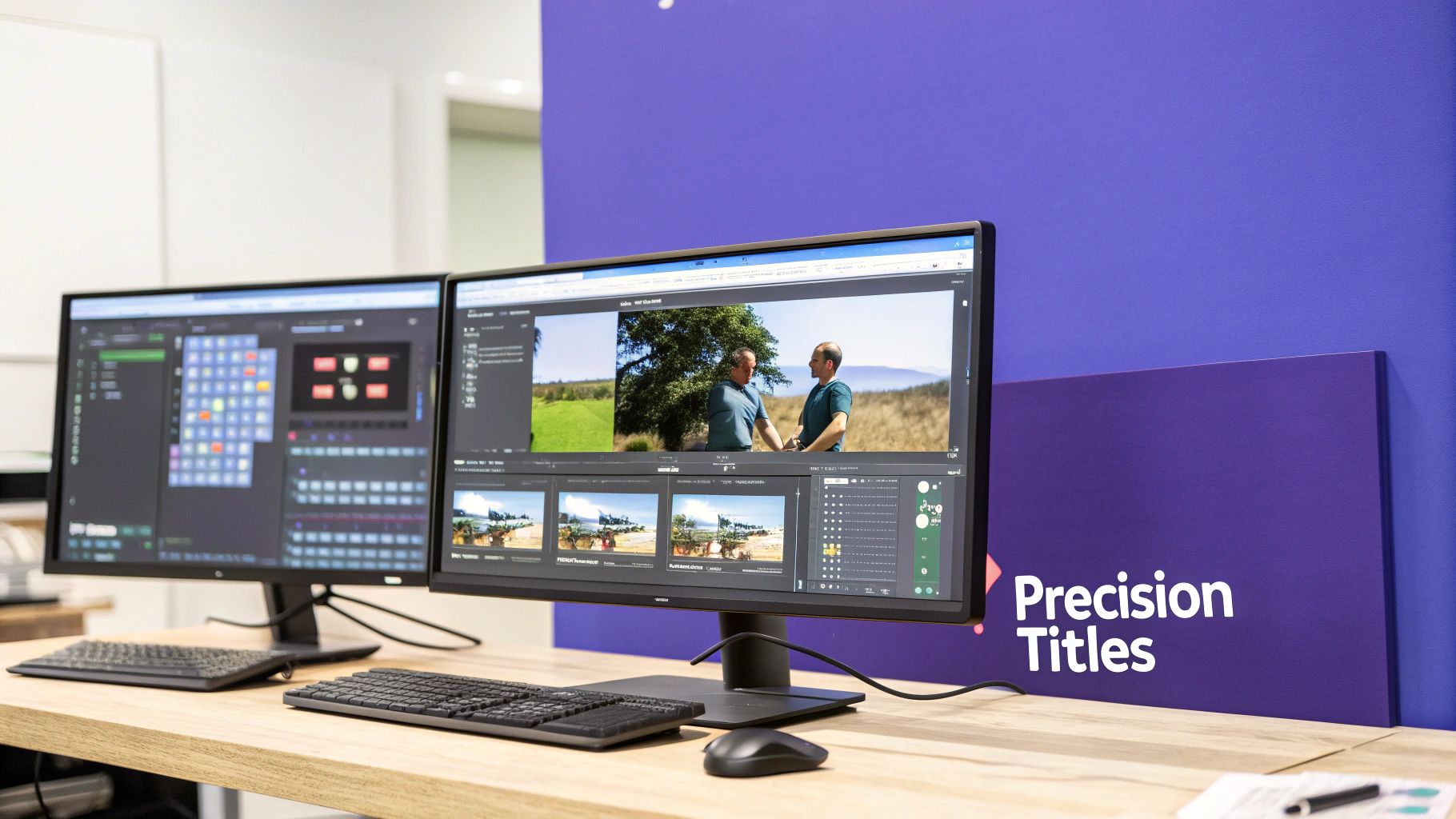
Figure 2: A professional desktop editing setup, which provides the necessary control for high-quality, branded video content.
Decision Framework: When to Use a Desktop Editor
- Use when: Brand consistency is critical. You need to save and reuse custom text templates and presets, a process that can save hundreds of hours per year.
- Use when: Complex animations are required. A lower third that takes 20 minutes to build on desktop offers far more control than a 30-second mobile template.
- Avoid when: Speed is the primary goal. The learning curve is steep, and production is slow.
Creating On-Brand and Readable Titles
If text is not instantly readable, it has failed. Desktop editors provide the tools to prevent this.
- Font and Sizing: Use clean, sans-serif fonts like Roboto or Inter. For a standard 1080p (1920x1080) video, set main titles to 72-90pt. Use 48-60pt for lower thirds or subtitles.
- Color and Contrast: Ensure a text-to-background contrast ratio of at least 4.5:1 to meet WCAG AA accessibility standards. Use a digital contrast checker to verify.
- Positioning with Safe Zones: Enable safe-zone guides in your editor. For YouTube, keep essential text within the inner 90% title-safe area to avoid being obscured by player controls. For more, see our guide on using strokes, shadows, and outlines effectively.
Animating Text with Keyframes
Static text is functional; animated text captures attention. The mechanism for professional animation is keyframes. Keyframes mark a property's value (e.g., position, opacity) at a specific point in time, and the software interpolates the motion between them.
Example Workflow: Fade-In Slide-Up
- Position your text layer at its final destination on the timeline at the 2-second mark. Set a keyframe for
PositionandOpacity(100%). - Move the playhead back to the 1-second mark.
- Adjust the text properties: move its vertical position down by 50 pixels and set
Opacityto 0%. The editor automatically creates new starting keyframes.
The software now generates a smooth, one-second animation between these two states.
Adding Text on Mobile for Social Media
For platforms like TikTok and Instagram, speed is the primary production metric. The ability to react to a trend in minutes is critical. Mobile editors like CapCut are designed for rapid creation, offering one-tap text animations, auto-captions, and trending effects that are native to the platform.

Figure 3: Mobile apps are the standard for adding quick, stylized text and captions for social media platforms like TikTok and Instagram Reels.
A Practical Mobile Workflow with CapCut
A mobile workflow should take less than 10 minutes from import to export. The goal is to add, style, and time text efficiently for immediate publishing.
- Import Clip: Open CapCut, start a new project, and import the video from your camera roll.
- Add Text Layer: Use the "Text" tool to type your message, which adds a text layer to your timeline.
- Style and Animate: Select the text layer. Use the "Style" tab for fonts and colors. In the "Animation" tab, choose an effect like "Typewriter" and set its duration to a punchy 0.3-0.5 seconds.
- Time on Timeline: Drag the ends of the text clip on the timeline to control its on-screen duration. Stack multiple text layers for dynamic effects.
Platform-Specific Text Placement
Incorrect text placement leads to it being obscured by the platform's user interface.
- TikTok: The bottom and right edges are UI-heavy zones. On a 1080x1920 video, keep text at least 150px from the bottom and 80px from the right.
- Instagram Reels: The bottom third is occupied by the caption and profile info. Position critical text within the central 50% of the frame for guaranteed visibility.
For a complete breakdown of safe zones, reference our guide to vertical framing and platform safe zones.
Real-World Example:
- Scenario: A tech reviewer needs to highlight a product's specific model number (e.g., "RTX 4090") in a YouTube Short.
- Workflow: He shoots the clip, imports it into CapCut, and adds the text "RTX 4090". He positions it in the upper-middle third of the frame, well within Instagram's and TikTok's safe zones, ensuring it is never covered. The entire process takes less than five minutes.
Common Mistakes & Fixes
Adding text is simple. Adding text well requires attention to detail. Common oversights in legibility, placement, and timing can reduce a video's professional quality.

Figure 4: Addressing common text legibility issues is crucial for ensuring your message is communicated effectively to the audience.
- Issue → Text disappears against a busy or moving background.
Fix → Add a semi-transparent black background behind the text with an opacity between 60-80%. Alternatively, apply a subtle drop shadow (Offset: 2px, Blur: 4px, Opacity: 50%) to lift the text. - Issue → The platform's interface (likes, comments) covers the text.
Fix → Design within platform safe zones. For a 1080x1920 vertical video, keep text at least 150px from the bottom and 80px from the right. For 16:9 YouTube videos, stay within the inner 90% title-safe area. - Issue → Text disappears before the viewer can read it.
Fix → Use the "three-word rule": allow at least one full second of screen time for every three words of text. A ten-word sentence should be visible for 3-4 seconds. For precise timing of dialogue, process your script with a tool like the ClickyApps Transcript Cleaner to generate clean, well-paced caption segments. - Issue → Text animations are distracting and overly complex.
Fix → Use functional animations like fades or slides with a duration of 0.3-0.5 seconds. Avoid chaotic effects like spins or strobes unless it is a specific creative choice.
Frequently Asked Questions
1. What are the best fonts for video subtitles?
Readability is the only priority. Use clean, sans-serif fonts like Roboto, Inter, or Helvetica Neue. For a 1080p video, a font size between 48-60pt is standard. Ensure legibility against any background by adding a subtle stroke or a semi-transparent background box (70% opacity).
2. How do I choose between burned-in text and separate caption files?
This is a platform-dependent decision.
- Burned-in Text (Open Captions): Use for TikTok and Instagram, where text is a stylistic element and videos autoplay on mute. The text is permanently part of the video pixels.
- Separate Files (.SRT, Closed Captions): Use for YouTube. This provides viewers the option to turn captions on/off, improves accessibility, and provides text for YouTube's search algorithm to index.
3. What is the standard on-screen duration for text?
The text must remain on screen long enough to be read comfortably. A reliable metric is to allow one second of screen time for every three words. For a 12-word sentence, it should be visible for at least 4 seconds. Always review the final video to ensure the pacing feels natural.
4. How do I ensure my text color is accessible?
Your text color must have sufficient contrast against its background. The standard is a contrast ratio of at least 4.5:1 (WCAG AA). Do not estimate this visually; use a free online contrast checker tool to input the hex codes of your text and background colors to get an exact ratio.
5. How can I maintain text style consistency across many videos?
In desktop editors like DaVinci Resolve or Premiere Pro, create and save text style presets or motion graphics templates (.mogrt). This allows you to save font, size, color, and animation settings to be applied with one click, saving hours of manual work and ensuring brand consistency.
Related ClickyApps Tools:
- Transcript Cleaner: Format scripts for perfect caption timing.
- Vertical Framing Guide: Master safe zones for every platform.
- Captioning Guide: Learn how to add .SRT files to your videos.
- Thumbnail Legibility Toolkit: Apply design principles to your text.