Thumbnail text only works when it punches through noisy footage on the smallest screens. This legibility toolkit shows how to combine strokes, shadows, highlight plates, and quick device checks using the Contrast Checker so your hook reads the same on YouTube, TikTok, and Instagram without guessing in Photoshop.
Table of Contents
Category hub: /creator/thumbnails
Legibility Toolkit Overview
Most legibility issues trace back to the first 10 seconds of your workflow: rushing the first color pass, eyeballing stroke thickness, or exporting without verifying ratios. The Contrast Checker turns that guesswork into a checklist—sample every hotspot, fix the weak ones, then lock a repeatable stack you can hand off to an editor.
Where legibility fails first
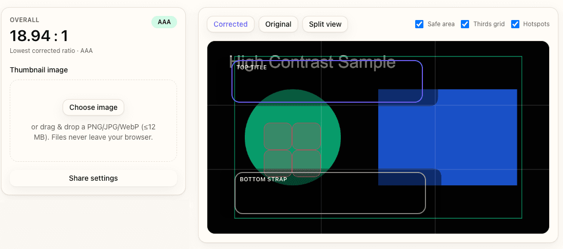
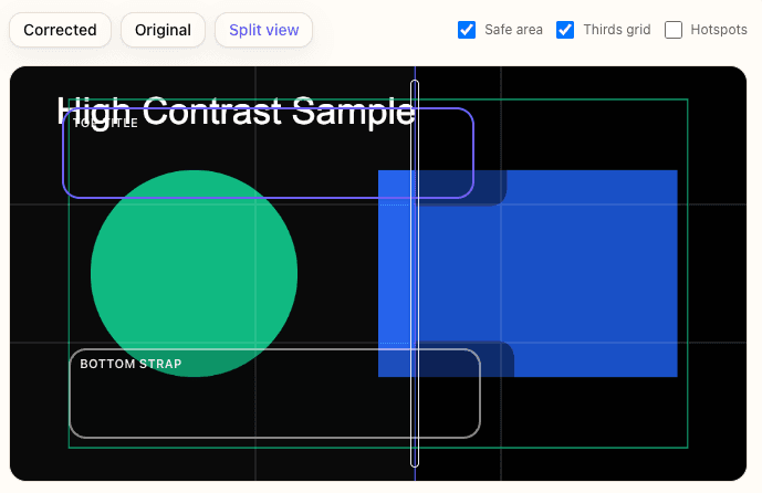
Failures start when text blends with footage, when glow plates over-brighten skin, or when shadows get crushed by platform compression. All three issues show up instantly inside the checker because each focus zone is scored (AA/AAA) with large-text thresholds labeled, so you can see which area needs a stroke boost versus a plate.
How Contrast Checker speeds fixes
Every overlay stores sampled colors, stroke/padding sliders, highlight plates, and export toggles. That means you can A/B a few stroke options, compare ratios, and lock the winning recipe without toggling layers in Photoshop. When you eventually send assets through the Thumbnail Resizer or Aspect Ratio Converter, you still have a written spec of stroke widths, glow color, and plate opacity.
Quick Start
- Load your thumbnail in the Contrast Checker and add focus zones over every text block.
- Sample current text/background colors and note which ratios miss 4.5:1 or 3:1.
- Increase inner/outer strokes until the live ratio passes, keeping inner strokes ≥3 px.
- Layer a soft shadow or highlight plate where footage stays noisy, re-measuring after each tweak.
- Export the corrected thumbnail plus the Markdown report for your team.
Audit Base Contrast Before Styling
Never touch strokes or shadows until you understand the raw ratio of each text block. That baseline tells you whether to adjust fills, add a plate, or simply sample a better background patch. You only get about 90 seconds before your eyes normalize to a flat image, so make the first pass systematic.
Sample multiple text zones
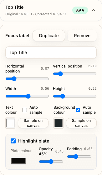
Add overlays for headline, subhead, face highlights, and any CTA chips. Sampling each zone ensures you catch micro-contrast issues (like a letter overlapping a flare) instead of just measuring the average canvas.
Decide fill vs plate adjustments
If a focus zone is only ~0.5 ratio points under the target, adjust the text fill or add a subtle inner stroke. If it is 1+ ratio point under, bring in a highlight plate (20–40% opacity) or darken the background via the overlay controls. Use snapshots to record each change so you can revert quickly.
Design Strokes That Survive Compression
Strokes have two jobs: maintain edge contrast and keep text readable when the platform blurs chroma. That requires setting thickness by export size and separating inner vs outer colors so compression cannot erase both layers at once.
Match stroke thickness to format
Use this baseline: 3–4 px inner stroke for 1280×720 exports, 5–6 px for 1080×1920 Shorts, and 2 px for grid thumbnails that stay small. If you need extra punch, keep the inner stroke tight and add a 6–8 px outer stroke with reduced opacity so halos stay soft.
Pick inner vs outer colors intelligently
Pair a high-contrast inner stroke (usually near-black or near-white) with an outer stroke that samples the scene color but sits 15–20 L* units darker or lighter. This keeps the edge natural while still surpassing 3:1 when compressed. Keep both colors logged in the overlay notes so collaborators can recreate them later.
Layer Shadows and Glow Plates Without Muddying Text
Shadows and glows add depth, but they also eat legibility if you stack them without a plan. Work in this order: inner shadow to add weight, directional drop shadow for depth, glow for emphasis, and finally highlight plates when footage stays chaotic.
Directional vs ambient shadows
Use a short, high-opacity inner shadow (distance ≤2 px) to anchor the type, then a longer drop shadow at 120° or 240° with 35–45% opacity. Lock blur radius between 6–12 px so it stays visible after upload. Avoid stacking more than two drop shadows; instead, offset the highlight plate to mimic ambient light.
Glow + plate stacks for portraits vs straps
Portrait-driven thumbnails benefit from a subtle glow (5–10% opacity) combined with a neutral highlight plate at 25–35% to carve faces out of backgrounds. Text straps usually need the opposite: stronger plate opacity (40–55%) plus a restrained glow so letters look beveled without bleeding. Toggle “Include highlight plate in corrected image” when you are ready to bake the plate into the export.
Outline Busy Footage With Hybrid Treatments
When footage is chaotic—fire, confetti, motion blur—you need more than strokes. Combine straps, badges, and contour outlines so you can preserve the edit without repainting the scene.
Straps and badges
A 65–75% opaque strap with rounded corners buys you repeatable contrast for CTA text. Add a 1 px inset stroke in the strap color plus a 2 px outer stroke matching platform chrome so it feels native. For badges, keep diameter at least 15% of the canvas width so they stay readable in Shorts feeds.
Edge-cleanup workflow
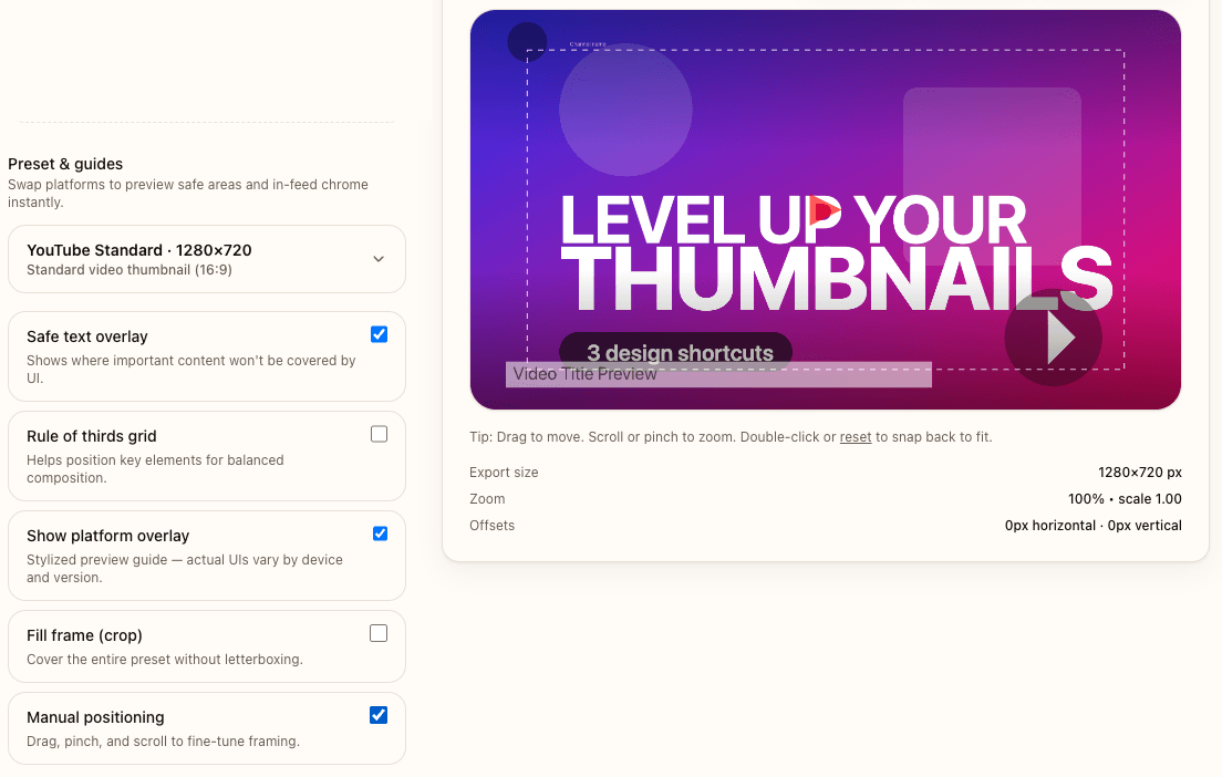
Use the Contrast Checker overlays on faces or props to see whether you need extra contour lines. After you export, drop the art into the Thumbnail Resizer to preview safe areas and ensure straps avoid UI chrome. If a crop still trims a badge, reopen the working file and reposition using the Aspect Ratio Converter pad mode instead of rebuilding the outline stack from scratch.
Preview and Package Deliverables
Legibility checks mean nothing if you never preview the final export at realistic sizes. Build a ritual: zoom to 25%, grab a phone screenshot, and drop the spec into your project management tool so no one flattens the layers later.
25% zoom plus phone screenshot
After exporting from the Contrast Checker, drop the art into the Thumbnail Resizer with safe text overlays enabled, keep zoom at fit-to-frame (≈25% on desktop), and then load the PNG on your phone for a quick screenshot. That simulates how YouTube shows thumbnails on the Home feed. If strokes disappear, go back and increase inner stroke contrast by 5–10%.
Share spec sheet from Contrast Checker
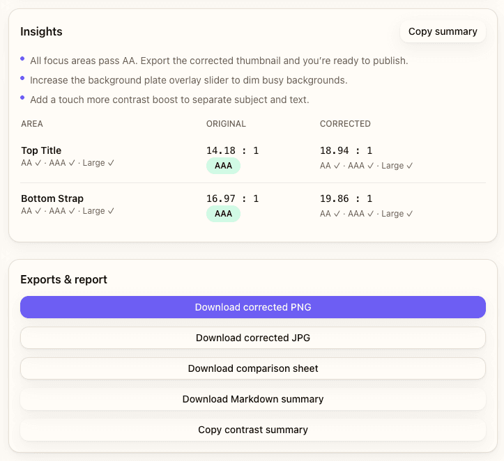
Use the Markdown export to capture stroke widths, glow opacity, plate colors, and safe-area notes. Post that spec wherever you store assets so editors, designers, and even the Title A/B Tracker team can keep legibility consistent while testing multiple hooks.
Examples
Neon text rescue
Bright neon text on warm footage usually fails because both hues live in the same luminance range. The fix: add a charcoal inner stroke, then place a 35% opacity slate-blue plate under the text. Re-sample and confirm ≥4.5:1 before exporting alternate colorways.
Dark portrait pop
Dark backgrounds plus moody portraits often need an inverted solution: pale outer stroke, gentle warm glow, and a 45% opacity badge for the CTA. Run the same stack across every face overlay so the set feels cohesive.
Common Mistakes & Fixes
- Hairline strokes on Shorts → Keep inner strokes ≥5 px on 1080×1920 exports so mobile compression does not erase them.
- Overusing pure black plates → Sample a darker hue from the scene instead; absolute black makes straps look pasted on.
- Glow overpowering faces → Cap glow opacity at 12% and add a subtle plate instead of chasing brightness with blur.
- Forgetting safe areas when outlining → Run the art through the Thumbnail Resizer safe overlays before you finalize straps or badges.
- Skipping phone preview → Always capture a mobile screenshot; desktop-only reviews hide legibility issues.
FAQs
- How thick should strokes be for 16:9 vs 9:16 exports?
- Start at 3–4 px inner + 4–6 px outer for 16:9 YouTube thumbnails and 5–6 px inner + 7–9 px outer for 9:16 Shorts. Adjust after re-measuring ratios in the checker.
- Should outlines always be pure black?
- No. Neutral darks look pasted on; sample a hue already in the scene but push it 15–20 L* darker so it still clears 4.5:1.
- When do shadows blur text instead of helping?
- If blur radius exceeds 12 px or opacity crosses 50%, compression smears the shadow and reduces edge clarity. Keep blur moderate and rely on highlight plates for extra contrast.
- How do I avoid gradient strokes banding?
- Use two flat-color strokes stacked together. Gradients get quantized during upload and create banding that lowers contrast.
- What’s the fastest way to QA multiple colorways?
- Duplicate overlays inside the Contrast Checker, sample each colorway, and export Markdown reports so collaborators know which settings cleared ratios.
- Do WCAG ratios really apply to huge text?
- Yes—the AA/AAA numbers give you a safety buffer against compression. For very large text, meeting large-text thresholds (3:1 / 4.5:1) is enough, but aim higher when possible.