Effective thumbnails increase click-through rates (CTR) for working creators on YouTube, TikTok, and Instagram, leading to higher viewership and better algorithmic performance. This guide provides a direct, technical framework for designing thumbnails that convert impressions into views. By applying specific principles of composition, typography, and color theory, you can systematically improve your video's reach.
Table of Contents
- Quick Start
- 1. Use Bold, High-Contrast Colors
- 2. Include Compelling Facial Expressions
- 3. Use Large, Readable Text Overlays
- 4. Strategic Use of Visual Elements and Icons
- 5. Maintain Brand Consistency
- 6. Avoid Clickbait While Maintaining Curiosity
- 7. Optimize for Mobile Viewing
- 8. Use Contrast and Foreground-Background Separation
- 9. A/B Test Your Thumbnails
- 10. Design for Series and Topic Recognition
- Common Mistakes & Fixes
- Frequently Asked Questions
- Related Tools
Quick Start
- Set Dimensions: Create your canvas at 1280×720 pixels (16:9 aspect ratio).
- Establish High Contrast: Use 2-3 bold, complementary colors. Ensure the main subject is at least 30% brighter or darker than the background.
- Add Minimal Text: Use 1-3 high-impact words in a bold, sans-serif font (e.g., Montserrat Extra Bold).
- Isolate the Subject: Cut out the main subject and add a 4-8 pixel stroke or outer glow to separate it from the background.
- Position Safely: Keep all critical elements away from the bottom-right corner to avoid being obscured by the video length timestamp.
- Mobile Test: Before exporting, shrink the thumbnail to ~160x90 pixels to verify that the expression, subject, and text are instantly legible.
1. Use Bold, High-Contrast Colors
Your thumbnail competes for attention against dozens of others. A high-contrast color palette ensures key elements are distinguishable from the background, even when scaled down on a mobile device. This visual clarity is crucial for stopping a user from scrolling past your content.
Caption: A high-contrast color palette makes your thumbnail stand out in crowded user feeds.
High contrast makes your content more visually accessible, directly impacting your click-through rate (CTR). Muted or low-contrast thumbnails blend into the platform's user interface (reds, whites, dark grays) and become invisible.
For example, a thumbnail with a bright yellow subject against a deep blue background has high chromatic contrast. Another example is placing a well-lit face (high value) against a darkened, desaturated background (low value). This technique creates immediate visual hierarchy.
Actionable Implementation Steps
- Limit Your Palette: Stick to 2-3 dominant colors. A common structure is a bright, saturated foreground color against a dark or desaturated background.
- Leverage Complementary Colors: Use a color wheel to find opposites like blue and orange or red and green. This pairing naturally creates strong visual separation.
- Test for Small-Screen Legibility: Before publishing, shrink your thumbnail to 160×90 pixels. If the main subject is still clearly identifiable, your contrast is sufficient.
- Use a Contrast Checker: A tool like the YouTube Thumbnail Contrast Checker can quantify if your text and background colors meet accessibility standards, ensuring legibility for all viewers.
2. Include Compelling Facial Expressions
Humans are instinctively drawn to faces. A thumbnail featuring a clear emotional expression creates an immediate connection and makes a viewer curious about the story behind the reaction. This strategy communicates the video's intended tone—shock, humor, or intrigue—efficiently.
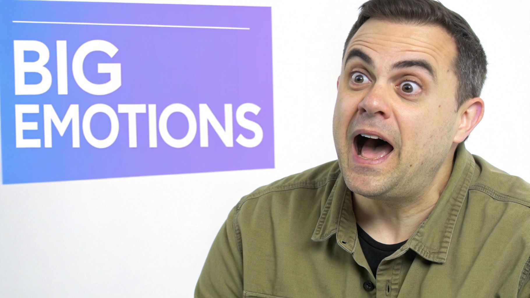
Caption: An exaggerated but authentic facial expression communicates the video's core emotion instantly.
This non-verbal storytelling is highly effective on a crowded feed where users make split-second decisions. It directly answers the viewer's subconscious question: "How will this video make me feel?"
Real-World Example: For a video tutorial on a difficult software feature, I tested two thumbnails. One showed the software interface. The other showed my face with a frustrated expression next to the interface, with text that read "FINALLY." The thumbnail with the human expression achieved a 2.1% higher CTR in the first 48 hours.
Actionable Implementation Steps
- Match Expression to Content: Ensure the emotion accurately reflects the video's content to avoid misleading viewers and causing a drop in audience retention.
- Exaggerate Subtly: The emotion must be clear at a small size. Slightly widen your eyes for surprise or open your mouth for shock. The goal is expression, not caricature.
- Ensure Facial Clarity: The face should be well-lit, in focus, and occupy at least 25% of the thumbnail height. Test at 168x94 pixels to confirm the expression is still visible.
- A/B Test Expressions: Use YouTube's "Test & Compare Thumbnails" feature to test a neutral expression against an emotional one. Analyze which one yields a higher CTR over a 72-hour period.
3. Use Large, Readable Text Overlays
Strategically placed text communicates your video's value proposition instantly. The key is to keep text minimal and bold, ensuring it is legible even when shrunk down. This practice transforms your thumbnail from a picture into an informative billboard for your content.

Caption: Minimal, high-contrast text quickly communicates the video's core topic or benefit.
The goal is zero cognitive load; the viewer should absorb the text's meaning in a fraction of a second. This clarifies the video's topic, boosting relevance and attracting the right audience.
When choosing text, focus on the outcome. Instead of "How to Fix Your Laptop," use "LAPTOP FIXED!" This is more active and communicates the resolution that viewers are seeking.
Actionable Implementation Steps
- Keep It Brief: Limit text to a maximum of 3-4 powerful words.
- Prioritize Contrast: Use bright text colors (white, yellow) with a dark stroke (outline) or drop shadow. This ensures readability against any background. For a white font, a black stroke of 8-12 pixels with 100% opacity works well.
- Use Bold, Sans-Serif Fonts: Choose thick, clean fonts like Montserrat Bold, Impact, or Bebas Neue. Avoid thin or cursive fonts.
- Mind the Safe Areas: Position text away from the corners, especially the bottom right, which is obscured by the video length timestamp. Keep text at least 8-12% inside the edges. You can learn more about thumbnail text safe areas.
4. Strategic Use of Visual Elements and Icons
Supplementary visual elements like arrows, circles, and icons guide the viewer's eye and add context. Used strategically, these graphics highlight the most important part of the thumbnail and make its message instantly understandable. They serve as visual shorthand, conveying information faster than text.
An arrow pointing to a surprising result or a red circle around a key object tells the viewer exactly where to look. This eliminates ambiguity and reduces the cognitive load for the viewer, making a click more likely.
Decision Framework: Use an arrow when you need to show a cause-and-effect relationship or before-and-after. Use a circle or highlight when a specific detail on a complex image needs to be emphasized. Use an icon to represent a concept (e.g., a clock for speed, a dollar sign for money).
Actionable Implementation Steps
- Limit Your Graphics: Stick to 1-2 key supplementary elements per thumbnail. More will create a chaotic look that distracts from the core message.
- Ensure High Recognizability: Choose universally understood icons and shapes. A simple, bold red arrow is more effective than an ornate one.
- Use Directional Cues: Employ arrows and lines to create a visual flow, pointing from your face to the object of interest. This guides the viewer's gaze.
- Maintain Brand Consistency: Develop a consistent visual system. Use the same style of arrow or the same color border across thumbnails to build a recognizable brand identity.
5. Maintain Brand Consistency
A consistent visual identity across thumbnails helps viewers instantly recognize your content. This involves a cohesive system of colors, fonts, layouts, and recurring visual motifs. When a viewer can identify your video before reading the title, you have established a strong brand that builds trust.
This familiarity reduces the cognitive load required to decide to click. It turns a split-second decision from "What is this?" to "Oh, a new video from [Your Channel Name]!"
Real-World Example: The channel WIRED uses distinct, solid-color backgrounds for its different series—green for "Autocomplete Interview," blue for "Tech Support." This system allows regular viewers to immediately identify the video's format from the thumbnail alone, increasing clicks from their core audience.
Actionable Implementation Steps
- Create a Simple Style Guide: Define 2-3 primary brand colors (with HEX codes), 1-2 primary fonts, and a general layout template (e.g., face on the right, text on the left).
- Develop Signature Elements: Introduce a recurring visual element. This could be a colored border, a specific photo filter, or a logo in the same corner.
- Use Templates: Create master templates in your design software (Photoshop, Canva, Figma). This ensures consistency and dramatically speeds up your workflow.
- Evolve, Don't Revolutionize: Make changes to your brand style incrementally. Periodically refresh a color palette but avoid drastic overhauls that could confuse your audience.
6. Avoid Clickbait While Maintaining Curiosity
Misleading viewers with deceptive thumbnails erodes audience trust and leads to poor watch time. The sustainable alternative is to generate authentic curiosity that accurately reflects the video's content. This builds a loyal audience that trusts your content to deliver on its promises.
When a thumbnail is deceptive, viewers leave quickly. This "bounce" signals to the algorithm that the video is unsatisfying, harming its long-term discoverability. The goal is to create a "curiosity gap" that the video genuinely closes.
Caption: Effective thumbnails create a "curiosity gap" by hinting at a resolution without misrepresenting the content.
Platform-Specific Nuance: On YouTube, where watch time is a key ranking factor, avoiding clickbait is critical. On platforms like TikTok, where content is shorter and consumed faster, slightly more exaggerated visuals may be effective, but the core promise must still be delivered within seconds.
Actionable Implementation Steps
- Show an Outcome, Hide the Process: Display a surprising but real result from your video. For a DIY project, show the final product without revealing the key step that made it possible.
- Use Legitimate Questions: Frame your thumbnail text as a question that your video directly answers. Avoid rhetorical questions that mislead.
- Maintain Emotional Honesty: Your facial expression should reflect the genuine tone of the video. An exaggerated shocked face is clickbait if the content is a calm review.
- Focus on the Value Proposition: Instead of shock, highlight what the viewer will gain. Text like "How I Read 100 Books a Year" creates curiosity around a valuable outcome.
7. Optimize for Mobile Viewing
With over 70% of YouTube views happening on mobile, optimizing for small screens is mandatory. A thumbnail that looks good on a monitor can become an unreadable mess on a phone. Mobile optimization ensures your thumbnail's core message remains clear and clickable.

Caption: Mobile-first design requires simplified compositions with large, clear subjects and minimal text.
On a mobile device, your thumbnail is smaller and competes with a dense feed. Intricate details, thin fonts, and subtle color gradients vanish at this scale. A mobile-first approach forces you to simplify your design to its most essential components.
Real-World Example: I once designed a gaming thumbnail featuring four characters from a squad. On desktop, it was clear. On mobile, it was a jumble of colors. The CTR was 1.8%. I updated it to feature only one character's face with a shocked expression. The CTR for the next 7 days jumped to 4.2%.
Actionable Implementation Steps
- Shrink-Test Designs: Before finalizing, view your thumbnail at the size it will appear on a mobile feed (approximately 168x94 pixels). This test immediately reveals legibility issues.
- Centralize Key Elements: Keep the most important visual information within the center 50% of the canvas. This protects it from being obscured by UI elements.
- Simplify and Enlarge: Avoid fine details and complex backgrounds. Opt for one dominant subject and use large, bold fonts.
- Focus on a Single Concept: A mobile thumbnail has room for only one idea. Communicate one clear emotion, question, or promise.
8. Use Contrast and Foreground-Background Separation
A thumbnail with a clear visual hierarchy directs the viewer's eye to the most important element. Strong foreground-background separation makes your subject "pop," ensuring it is instantly recognizable. This technique is fundamental to effective visual communication.
Caption: Using blur, outlines, and value contrast separates the subject from the background, creating a clear focal point.
When a subject and background blend, the brain works harder to decipher the image, often causing the viewer to scroll past. A clear separation creates an effortless viewing experience.
This practice makes your content look polished and easy to understand. Tech reviewers often place a brightly lit product against a dark background. Lifestyle creators use a shallow depth of field to keep their faces in focus while blurring the environment.
Actionable Implementation Steps
- Create Value Contrast: Ensure your subject is significantly lighter or darker than the background.
- Use Depth of Field: Apply a Gaussian or lens blur (radius of 4-8 pixels) on the background layer in your editing software. This instantly separates the sharp foreground subject.
- Apply Outlines or Glows: Add a subtle outer glow or a thin (5-10 pixel), crisp outline around your subject. This creates a border that visually lifts it off the background.
- Leverage Vignetting: Apply a subtle, dark vignette (20-30% intensity) around the edges of the thumbnail. This effect naturally draws the eye toward the brighter center.
9. A/B Test Your Thumbnails
Designing based on best practices is a strong start, but data-driven optimization provides a competitive edge. A/B testing is the process of comparing two or more thumbnail versions to see which performs better. This method replaces guesswork with concrete evidence.
What works for another channel may not work for yours. A/B testing allows you to systematically discover the visual language that resonates with your specific audience, leading to a higher CTR. Over time, these incremental CTR gains compound, signaling to the algorithm that your content is engaging.
Technical Workflow: Use YouTube's native "Test & Compare" feature. For a new video, upload two thumbnails (e.g., Variant A with red text, Variant B with yellow text). YouTube will distribute impressions evenly between them. After 72 hours, the feature will report which thumbnail achieved a higher CTR.
Actionable Implementation Steps
- Change Only One Element Per Test: To get clear results, test only one variable at a time (e.g., background color, text, or facial expression).
- Run Tests for a Sufficient Duration: Let tests run for at least 72 hours to gather enough data. For videos with slower traffic, a 7-day test may be necessary.
- Track CTR and Watch Time: A thumbnail that gets clicks but results in low watch time may be misleading. The winning variant should not negatively impact audience retention.
- Document Findings: Keep a log of your tests: variations, CTR results, and conclusions. This log becomes an invaluable internal guide for your channel's visual strategy. To ensure accuracy, learn more about how to avoid A/B testing bias.
10. Design for Series and Topic Recognition
Creating a consistent design system for content series builds a powerful shortcut for your audience. When a viewer can instantly recognize that a video is part of a series they enjoy, they are far more likely to click. This transforms your thumbnails into an organized, branded content library.
A well-designed series template acts as a visual cue, communicating the video's format or topic before the viewer reads the title. This predictability fosters loyalty and boosts view-through rates for content pillars on your channel. You can see this in action for everything from long-form content to optimizing your YouTube Shorts thumbnail for series.
For example, a "Product Review" series could always use a yellow border and a specific font, while a "Tutorial" series uses a green border. This simple system makes your channel page easier to navigate and encourages binge-watching.
Actionable Implementation Steps
- Assign Visual Identifiers: Dedicate a specific color, layout, or icon to each content series.
- Create Reusable Templates: Build a base template for each series in your design software. This should have fixed elements (logo, color scheme) and variable sections (main image, text).
- Balance Consistency and Novelty: While templates are crucial, ensure the main visual hook of each thumbnail is unique enough to stand out on its own.
- Test Your System: After implementing a new design system, monitor your analytics. Check if videos within a branded series have a higher CTR or better audience retention than non-series content.
Common Mistakes & Fixes
- Issue → Text is Unreadable on Mobile: Font is too thin, too small, or has low contrast with the background.
- Fix: Use a bold, sans-serif font. Add a dark stroke (outline) or a solid color block behind the text to guarantee contrast. Always shrink-test your final design to 160x90 pixels.
- Issue → Visual Clutter: Too many elements (text, icons, multiple people) compete for attention.
- Fix: Simplify to one clear focal point. Limit text to 3 words and use no more than one supplementary graphic (e.g., one arrow or one circle, not both).
- Issue → Brand Inconsistency: Every thumbnail looks completely different, preventing viewers from recognizing your content.
- Fix: Create a simple style guide with 2-3 brand colors, one primary font, and a consistent placement for your logo or a signature border. Use templates.
- Issue → Misleading Content (Clickbait): The thumbnail promises something the video does not deliver, causing low audience retention.
- Fix: Ensure the thumbnail's main visual and text accurately represent the core topic of the video. Focus on creating curiosity around a real outcome shown in the video.
Frequently Asked Questions
1. What are the exact dimensions for a YouTube thumbnail in 2025?
The standard dimensions remain 1280 pixels by 720 pixels, which is a 16:9 aspect ratio. The minimum width is 640 pixels. Save the file as a JPG, PNG, or GIF under the 2MB size limit.
2. How many words should I use on a thumbnail?
Aim for 1 to 4 words maximum. The goal is instant comprehension. Use powerful keywords that summarize the video's core benefit or question. For example, "Passive Income SECRET" is more effective than "My Guide to Making Passive Income."
3. Should I include my face in every thumbnail?
If your channel is personality-driven (vlogs, commentary, education), yes. A human face builds connection. For faceless channels (e.g., product animations, screen recordings), use a highly engaging and clear visual of the topic instead.
4. How important is a logo on the thumbnail?
A small, consistently placed logo can aid in branding. However, it should never be the primary focus. Place it in a corner (e.g., top-left) where it does not interfere with the main subject or text. It should occupy less than 5% of the total thumbnail area.
5. Does changing an old thumbnail affect video performance?
Yes. Updating an underperforming video's thumbnail to align with current best practices can increase its CTR and cause the algorithm to re-test it with new audiences, potentially reviving a "dead" video.
Related Tools
- YouTube Thumbnail Downloader: Analyze competitors by downloading their thumbnail designs for inspiration.
- Color Palette Generator: Create professional, high-contrast color schemes for your brand.
- Image Background Remover: Quickly isolate subjects from their backgrounds to create clean compositions.
- Font Pairing Tool: Find bold, readable fonts that match your channel's brand identity.
- A/B Testing Calculator: Determine the statistical significance of your thumbnail tests.
Ready to streamline your entire content creation workflow? The ClickyApps suite offers integrated tools for asset management, collaborative editing, and performance tracking, helping you implement these best practices efficiently at Clickyapps.com.